关于页面上的 settings 的一点小吐槽 [A small complaint about the settings on the page]
最近重度使用,对话的能力还是代码的生成都令我非常的惊艳。
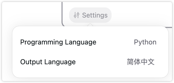
但是这个settings按钮我觉得可能需要斟酌一下设计。
每次我打开首页开始使用的时候,都需要点击一下这里看看我之前选了什么programing language,因为我是需要经常多语言切换的,个人觉得不是很直观。
而且很繁琐,需要点击,再点击,选中,然后再点击一下让他消失,但是如果就一个下拉框的话会方便很多,我记得最初的版本就是这样的。
对话界面好像也看不到我当前的language是哪个。
我算是重度用户了,因为最近一天到晚用的比较多,所以会觉得越是方便用户操作和直观看到的设计才是好的设计吧,但是我的建议仅供参考,希望你们斟酌哈。🙂🙂
-
I've been using it heavily recently, and I'm really impressed by its conversational abilities and code generation capabilities.
However, I think the "settings" button design could be reconsidered:
Every time I open the homepage to start using it, I need to click here to see what programming language I had selected previously, since I often need to switch between multiple languages. Personally, I find it not very intuitive.
It's also quite cumbersome - I need to click, then click again, select, and then click again to make it disappear. If it was just a dropdown, it would be much more convenient. I remember the initial version had that.
In the conversation interface, it doesn't seem to show the current language either.
As a heavy user who has been using it a lot recently, I feel that the more user-friendly and intuitive the design is, the better. But these are just my suggestions for your consideration. Hope you find them helpful! 🙂🙂
Share update with 0 linked conversations as well
Completed
📥 Feedback
About 2 years ago

waiwen huang
Subscribe to post
Get notified by email when there are changes.
Completed
📥 Feedback
About 2 years ago
waiwen huang
Subscribe to post
Get notified by email when there are changes.